Dramatic Contexts
By Kate Garrett
Make-up Experimentation.


Evaluation.
Good points:
- The highlight on the forehead works really well, in photos at the angle of my portrait it looks really realistic I would move it slightly to the right
- Lightening his skin tone blends well into his ears and neck.
- Placement of shadows around the left eye
Bad Points:
-The shadow really aren't working for me they are way to big/thick i need to use less product and/or a thinnner brush
- Need to make the paint look more layered texture and thicker I will try foundations mixed with supra coloura nd other products to achieve this.
- Work on adding depth to the shadow
- Wrinkles in th eforehead look too flat- add into the flat piece?
Improvements
- Smaller brushes used when create shadows
- Layering colour for thicker looking texture/broken
- Stronger highlights
- Depth in the shadows
Supra colours used:
1w, 2w, 3w, 4w, (kryolan single layer surpa colour pallet)
Blocking out the brows.


Here I have trailed two different tones to see which pallet works best with his skin tone to block out th ebrows when applying my prosthetics over the top.
The left brow has a lighter peach colour which intially has covered the dark brown hair very well however under th eprosthetic piece it works well except you can see a dark ton ever so slightly more towards the nose than with the other brow.
the right brow has a more birghter coral tone and when under the prosthetic piece this works very well and makes the tone more even fro me to colour the prosthetic piece so this is the colour I will use for my assessments.
Blocked out brows, no prosthetics makeup.


From afar This looked really good and for a theatre context it would suit however for my portariat the brows look too untidy and flaky, they look almost too cakey compare to the rest of the colouring which has picked u on the edges. I think had I been using a liquid product or my illustator this would have worked better but as I want the thick layered look the edges are being picked up but the cream product so for me this no porstetic look isn't going to work for the effect I am after.
Hair.
For the hair I plan to set it in heated rollers as this will give me lift and curl which my portait has. In choosing my model his hair is a good length and has a natural curls so i need to control it adn work with it to create my piece. One thing I will need to consider is changing his colour, becuase of the context I am going to use a hair spray that applys colour rather than airbrush as it is a large area I will be covering and I want to do it fast and effectivly. If it was Tv I would use a lace from wig or dye the actors hair.


Texture - fullers earth.
My idea behind using fullers earth was to create the cracked oil painting look om the skin which I would then colour over the top. Belwo are the two comparisons before and afer colouring as you can see the colour isnt a smooth colour is it very staggered and the depth is very unequal. I found Applying cream products over the top very hard to get into the cracks. Even though my painintg was very cracked you could only see it when very up close so I am not going to use this technique for my make up as I feel it is too heavy for the texture I want it to have.
I could create a craked effect stencil and airbursh the tiny cracks over the final makeup, however I feel to get such tiny lines will be very difficult with acetate as from working with it before I found it very hard to control the sheet when creating small detail. I could also try painting on the cracks on very finely, but due to the constraints and the fact I have alredy got alot to apply colour and do this isn't essentail to my portait.
Colour prodcuts layering.

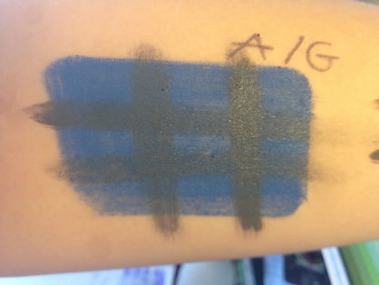


I think from previous experience to working with these prodcuts I want to use cream products as my main colouring product I have experimented with layer cream (grease pait, Kryolan Supra colours) with the water based kryolan aqua colours to see how they sit on top of each other as my portait includes alot of layering colours.
The top and bottom layer are both aqua colorus and used together they sit well however the bottom layer is quiet patchy and uneven, it looks very light on the skin which will not suit the heavy handed look I want.
This is Aqua colour on the bottom and supra colour over the top,becasue the aqua colour looked very patchy this time I layered 2 coat before trying the supra colour over the top. This had made it less patchy however It still loks very light on the skin and not heavy coverage. With the extra layer the grease paint was alot harder to keep in a bold line it didn't want to sit on top of the aqua colour.
Compared to the Aqua colour bases the supra colour is sitting very thickly on the skin with good coverage which I knwo will work well for the heavy painted look I want to create. The then toplayer of supra is bolder than when it was layerd over aqua. It is sitting on top and not blending into the under layer completely the edges are just merging and this look this is what I want. I want the layer to be distictive untill I blend them and I think this combination would be the best to achieve that.
This is supra colour on the bottom which as before is very heavy and shiny on the skin with aqua colour over the top, this worked alot better than I though it would the aqua colour hasn't blead away or looked watery which I am surprised at. This could be a possibilty for using in my makeup design, on the areas where I want complete distiction, maybe from the higlights to the base colour.